


 accesses since November 3, 2006
 copyright notice
accesses since November 3, 2006
copyright notice
accesses since November 3, 2006
Hal Berghel
Let me begin with a personal experience.
Many of you have experienced the joys of power boating, and have observed that some boats move over the water while others move through the water. Such is the business of hull design. Displacement hulls move through the water at slow speeds, can carry considerable cargo weight, and with great fuel efficiency. Large naval ships, cruise ships, tankers and freighters are examples of displacement hull watercraft.
Planing hulls, on the other hand, move on the water at greater speed and can carry much less weight. The neighbors jet ski, jazzed up fishing boat, and small cruisers illustrate the breed. Since planning hulls (and semi-displacement hulls) rise up from the water and tend to ride atop the waves and swells, balance is important. Unlike displacement hulls that float like corks, planning hulls rock from side to side, front to back, and all too frequently catch a rising wave with a shock that can shake the fillings out of teeth. Enter the world of trim tabs.
Trim tabs are platforms that extend from the rear of the boat. When they both go down, the stern rises and the bow goes down so the boat can cut through the waves rather than attempt to push them out of the way. Trim tabs are just about as ubiquitous to the upscale boating experience as life jackets and Sunbrella tops.
I was thinking about trim tabs while reading a magazine recently. According to the ad, Volvo QL has produced a new type of trim tab that doesn't require hanging huge metal slabs off the back of the boat at all. Rather, it thrusts metal panels down from the bottom of the boat. No protrusions from the transom to get in the way, and less power required to activate. What's not to like? As I'm reading the ad I'm building up serious interest while reading the one paragraph ad, the trailing sentence of which points me to www.qlmarine.com . Here's what I saw:
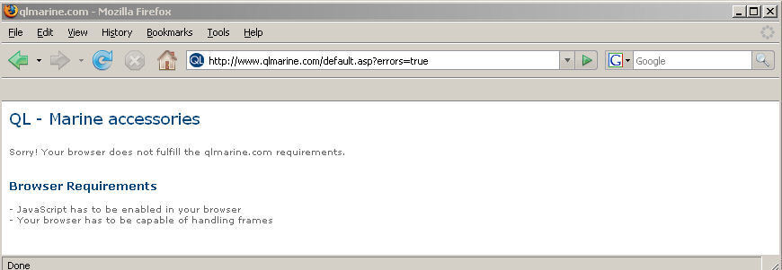
Figure 1: the Website as rendered in Mozilla Firefox 2
According to the Website, in order to view the VolvoQL product line and get the technical specs, I have to enable both JavaScript and frames. Well, I got news for them. JavaScript and frames were both enabled, so the error message was meaningless. We'll return to this point in a moment, but first I want to focus on the user experience.
Armed with enthusiasm, I was seriously considering a purchase, but Figure 1 shows where that got me. From my perspective, I invested a few minutes of my time in something that looked interesting, and at the point at which the browser blocked the content, my interest was gone. The Web mind is trained to work at microsecond speeds. Potential customers get engaged or lose interest instantaneously. And if the fist impression isn't positive, the seller may never get a second chance. Such is the case with QL Marine's trim tabs, my browser, and me.
From the marketing perspective, some consequences of my experience are obvious.
Just for the record, and I promise that this is the last I'll have to say about boating, trim tabs are powerboat options not requirements so customers have to really want them to justify the additional expense. We're not talking fire extinguishers and life jackets here. It's more like a carnuba wax shine nice to have, but definitely not a top priority. This fact makes the design of the Website even more absurd. The one thing that we don't want to do when we market upscale extravagances is provide unnecessary transaction barriers between us and our customers. This Website is as effective as placing an EAS tag on a grocery item that sounds an alarm if you try to put it in the cart: prospective buyers won't put up with the hassle especially for something inessential. If you assume that you have a captive audience in the trim tab business, you're unlikely to sell many the competition is too great, and the demand too low. Trim tabs aren't in a league with blood plasma and gasoline.
Now let's return to the browser issue. Like most security-minded (aka paranoid) folks, there are some basic rules of the road in the browsing experience:
These basic guidelines come at the price of convenience, to be sure. In fact, I personally add a few more rules for mission-critical workstations and servers:
but then, I wear a belt and suspenders. Most of you will find my approach biased too heavily on the security (vs. usability) side.
So what happened with my browser? Well, it wasn't related to the configuration at all. In fact, the page was optimized for Internet Explorer.
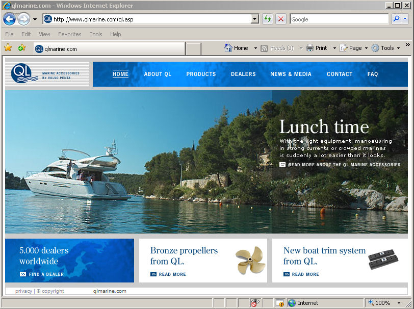
Figure 2: The Website as rendered in Internet Explorer 7 with essentially the same configuration settings as the Mozilla Firefox 2 browser in Figure 1
So the problem was that the Web designer wrote specifically for a vendor-specific browser. Since the configuration parameters were incompletely understood, generic error reporting was substituted for accurate diagnostics.
Unfortunately, this is not all that uncommon even on Fortune 1000 sites. Compare the rendering of HP.COM by Mozilla Firefox 2 and IE 7, below.
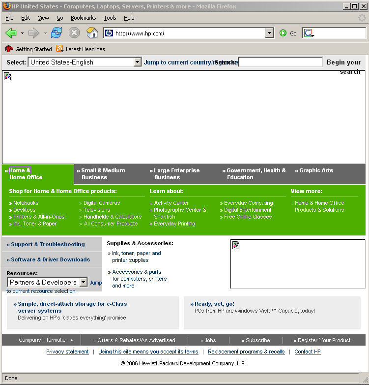
Figure 3: Mozilla 2 rendering of hp.com.
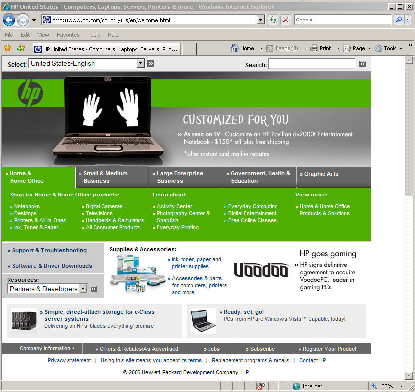
Figure 4: IE 7 rendering of hp.com.
The missing images aren't animations, Shockwave clips or streaming videos. They're GIF and JPG images. However, the HP site embeds them in IE-centric scripts. The result is the same as our first example, it discourages users who are either security-minded and/or Internet Explorer-averse from using the site, two groups I might add that I am, alas, a founding member.
Of course, it's a merchant's call with whom and how they want to run their business. Common sense tells me that these Websites are causing lost revenue from the market sectors they most want to attract. Trim tabs are most effective on larger boats, and people who own larger boats tend to be customers who can best afford their product. A recommendation for a computer brand from those with the most technology savvy is very effective and inexpensive advertising. Such being the case, the effect of these Websites tends to be inconsistent with my understanding of Internet-enabled commerce.
A quick glance back at the title of this column emphasizes two features of Websites that interfere with the maximum marketing potential of the Web. It's just not a good idea to report inaccurate error messages or develop sites with specific rendering tools in mind when the Internet and Web is involved. However, there are subtler principles involved as well.
Principle 1: When it comes to technology, not everything that we can do is worth doing.
Gratuitous graphics, unnecessary executable content, and developing content with a particular platform in mind is not the best way to increase sales with the Web. Anything that discourages potential customers is inherently suspect.
Principle 2: When it comes to Web sites, functionality should always prevail over form.
The valuable Web developer understands and internalizes the core business strategy of the organization, just like everyone else in the organization. The artistic content should always be of secondary concern.
Principle 3: The importance of Principles 1 and 2 increases with competition and the importance of the product/market.
The only gas station within a 50 mile radius can afford to have a convoluted GUI on the pump panel, but that won't work in urban areas. The local blood bank can probably be forgiven for a multitude of bad Website decisions. But that's not going to work in commodity industries like computer manufacturing and discretionary/impulse products.
So there we have it: 3 principles that should guide all of us in the design of enterprise Websites. What does your corporate Website look like in your customer's browser?
Hal Berghel is a security specialist that deals with everything from network forensics to identity theft and financial fraud. His clients include many 3-letter agencies, law enforcement, and large corporations in the technology sector. He is a widely acclaimed researcher, teacher, author, columnist, keynote speaker, and is the founder and owner of the security consultancy, Berghel.Net. Many of his articles and columns are available online at www.berghel.net.